Web Design and Development
We develop website with responsive web design,meeting the needs of our clients with UX, UI using PHP, Mysql, HTML5, CSS3, Javascript and Jquery.
Characteristics of our websites
-

Responsive Web Design
A website is designed and coded to adapt to different screen sizes and devices like desktop computers to all mobile devices.
Ver más -

Flat Design
Fresh and clean design with elegant typography with solid base color.
Ver más -

Parallax Effects
Create a compelling atractive visual effects making your website stand out from the rest.
Ver más -

Drupal
WE use Drupal CMS as a technology of development and site administration.
Ver más
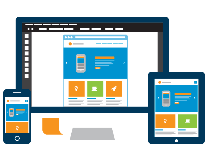
What is Responsive Web Design?
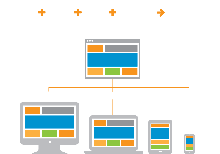
Responsive Web design is an approach whereby a designer creates a Web page that “responds to” or resizes itself depending on the type of device it is being seen through. That could be an oversized desktop computer monitor, a laptop, a 10-inch tablet, a 7-inch tablet, or a 4-inch smartphone screen.
¿Porque mi sitio debería tener Diseño Responsivo?
With the differences in screen size of the new devices, it is essential to have Responsive design that allows a web site to suit the multiple screen resolutions. When you have a website with responsive design it looks good on a smartphone, a tablet and not just n a desktop PC.
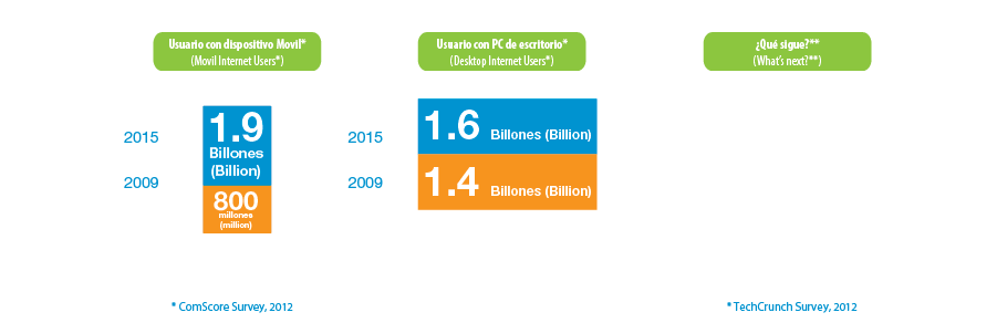
Ventajas del Diseño Web Responsivo
Applying the responsive design since the creation of a new web, several objectives are achieved.

Reduced development costs
It has a website optimized for all devices instead of an application for mobile devices and a website for PC.

Good User Experience
Much of users leave a website to enter from a mobile device is because they can not display the content properly. With responsive design, you always enjoy a good browsing experience.

Multi platform
Responsive design is supported by Already the majority of web Traffica  (70-80%).  For mobile devices, That support is even higher (90% +).

Higher performance
Having a page that looks optimized for phones and tablets, the percentage of users who purchase a product or submit a form is greater.

Save time
It saves time and money because it is not necessary to maintain separate websites for different devices.
Flat Design
Flat Design is a new trend that is becoming increasingly popular in the field of web design and / or mobile applications. Leaving aside the shadows, reliefs, textures and gradients to go for a much cleaner design, with crisp, elegant typography and solid colors as the main base.

Menos es más
Flat Design is a change in the conceptualization of forms and objects in the design in general (and more particularly on the web). We went from what we call "skeuomorphism" or the art of imitating reality, the more abstract representation of such objects and shapes.

Characteristics
This trend is invading all kinds of web designs and / or mobile applications, and even giants like Google or Apple have succumbed to the charms of this unique style featuring minimalist and simple visual elements.

Clean and minimalist compositions
They offer a clean and free of distractions content, while the texts are limited to what is strictly necessary.

Colors
Solid and vivid colors are the stars, subtly employees without creating visual fanfare.

Simple and elegant fonts
The text assumes a fundamental role in this type of design, so that the choice of proper typography is of great importance. Sans Serif fonts predominate, with smart use of sizes and formats for nesting bold content.

Absence of unnecessary effects
Absence of unnecessary effects that recharge the visual design environment. No shadows, gradients, textures or ornaments to ease the feeling of Design Plan and provide a clean, minimalist style used.

Geometric forms
Using geometric shapes to highlight images and for related graphic compositions.

Icons and buttons
Icons and simple buttons and vivid flat colors, with straight lines and sharp for perfect readability design.
What is Parallax Effect?
The Parallax Effect
It is a web design technique that allows its elements moving at varying speeds when the user scroll the site, creating an attractive visual effect.
Relatively new
Parallax is relatively new in web design, but widely used in gaming applications to create lateral displacement effects of 2-dimensional.
Methods to achieve Parallax
Parallax effect is achieved through the following methods: Raster; Handling Pattern; Sprite; and in this example: multi-layer method, which is the vertical and horizontal movement of the elements while moving at different speeds. Also with CSS..
¿Parallax on your website?
Thousands of websites use Parallax Effect to capture the user's attention, adding much attractive visual content and nice animations.
Website Administration
We use Drupal as a content management system (CMS), it is a development-oriented that facilitates the creation, updating and content management technology a website. Drupal is a multipurpose system that allows any type of web project with high complexities providing the flexibility and scalability.
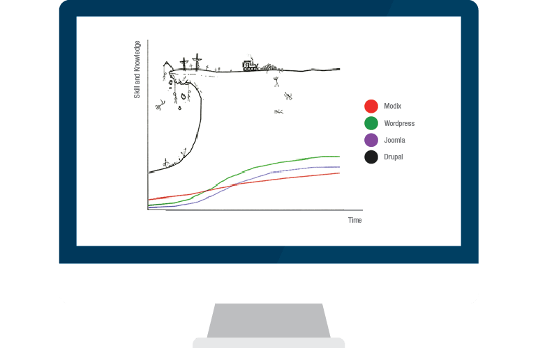
Drupal is the most robust
Drupal is one of the most complex CMS, and therefore their learning curve is hard, but once you handle the web developer can build large web projects to customer requirements and to obtain great benefits.
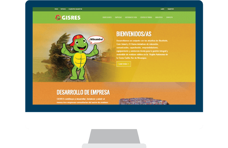
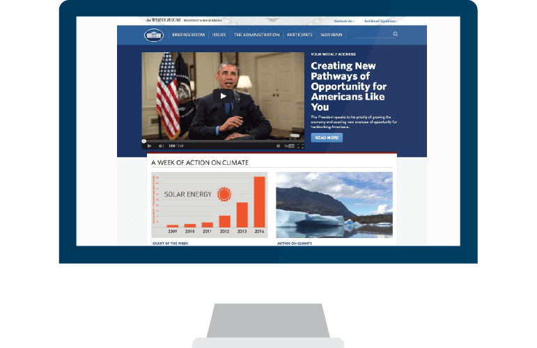
Developed websites with Drupal
These websites are:
Drupal Features

Flexible content
It standup for its flexibility, adaptability and its administration interface that lets you easily create new types of structured content as well as the large number of additional modules available, makes it suitable for many different types of websites, online shops, forums discussion, corporate websites, etc.

Multiuser
Visitors to the site are connected (as "authenticated" users) or browse the site without it (as users "anonymous"). You control your access levels, and can also assign "roles" for various levels of permissions.

Scaleable
Thanks to a huge community effort, over 800 modules are available or under active development for Drupal 7, including Views, Pathauto, and WYSIWYG, with many others along the way updated every day.

Accessible
Management screens are now much more accessible. Abundant interface improvements make it easier to build highly accessible websites.

Security
Drupal is used by thousands of high-profile websites and is subject to rigorous safety tests by both the Drupal community and security experts worldwide. Drupal core code has been shown to prevent common security vulnerabilities, as defined by the Project Open Web Application Security (OWASP).

Requirements
A web server: Apache (recommended), Nginx, Lighttpd, or Microsoft IIS; Database: MySQL 5.0.15 or later, PostgreSQL 8.3 or higher, or SQLite 3.x; PHP 5.2.4 and higher
¿Pórque usar Drupal?
Wordpress

- Webs pequeñas y medianas
- de programadores para usuarios de Internet
Drupal

- Para lo que quieras y más
- Por programadores para programadores
Joomla

- Webs medianas y grandes
- de programadores para usuarios de Internet
Web design packages
The main difference between the packages is the level of design. Both deliver an attractive look and feel but the amount of design and the customisation of the design differs for each package.Startup
For a startup business or anyone needing a web presence but doesn't have a large budget to invest…yet.
Desde $ 3002 weeks
- One Design Concept + One Revision
- 4 Page Website Design & Construction
- Images & Graphics Included
- Login area just to update website
- Video Tutorials For Using Website Login Area
- 1 Years Free Website Hosting & Domain Name Regist
- Email Account and signature Creation Included
- Basic Website SEO Included
- Responsive design (i.e. mobile friendly)
Professional
For small and medium sized companies who want to stand out from the crowd with a professional design.
Desde $ 6004 weeks
- One Design Concept + One Revision
- 8 Page Website Design & Construction
- Images & Graphics Included
- Login area to add, delete and update website
- Video Tutorials For Using Website Login Area
- 1 Years Free Website Hosting & Domain Name Regist
- Email Account and signature Creation Included
- Basic Website SEO Included
- Responsive design (i.e. mobile friendly)
- Desde
Business
For larger companies, or anyone requiring a custom design to integrate brand and marketing strategy.
Desde $ 1,2008 weeks
- One Design Concept + One Revision
- 12 Page Website Design & Construction
- Images & Graphics Included
- Login area to add, delete and update website
- Video Tutorials For Using Website Login Area
- 1 Years Free Website Hosting & Domain Name Regist
- Email Account and signature Creation Included
- Website SEO Included
- Responsive design (i.e. mobile friendly)
How we work?

Discovery
We collect information on objectives, target audience, capabilities, competition is analyzed and the industry or market belonging to better understand the customer is investigated. We define the concept for the design, organization of information and site planning.

Sketch
The design starts with sketches that can help us organize ideas for effective design and give a fresh and original at the same touch.

Prototype
Through our process quickly we build prototype of an interactive website in HTML, CSS and javascript and using colors and aesthetics of the same best guarantee results and accelerate the process of site development significantly. The customer interacts in a real way with the prototype by clicking and browse through the pages and give their opinion on the basis of the actual user experience.

Drupal Integration
Once the design is approved we proceed to integration with Drupal implementing the functionality of the site and preparing control panel for administration.

Testing
Functionality and responsive site design to detect and correct errors are tested.

Delivery
Video tutorials use and site management, and training sessions where he joined the site information will be made. Then we proceed to move the site development directory to the directory of the primary domain to put it online.